01. Overview
Redesign of the user profile hover-card on the GoProfiles platform to prevent blocking potential cursor paths as well as removing and including only the necessary information on the card.
02. Problem
The previous card had a vertical design which had to be positioned to the left or right of page elements, often blocking access to content. To view this content, users had to move the mouse cursor away from the hover cards.
An additional challenge was that because the card already had the majority of the information found on the user page, the user pages were not as frequently accessed.

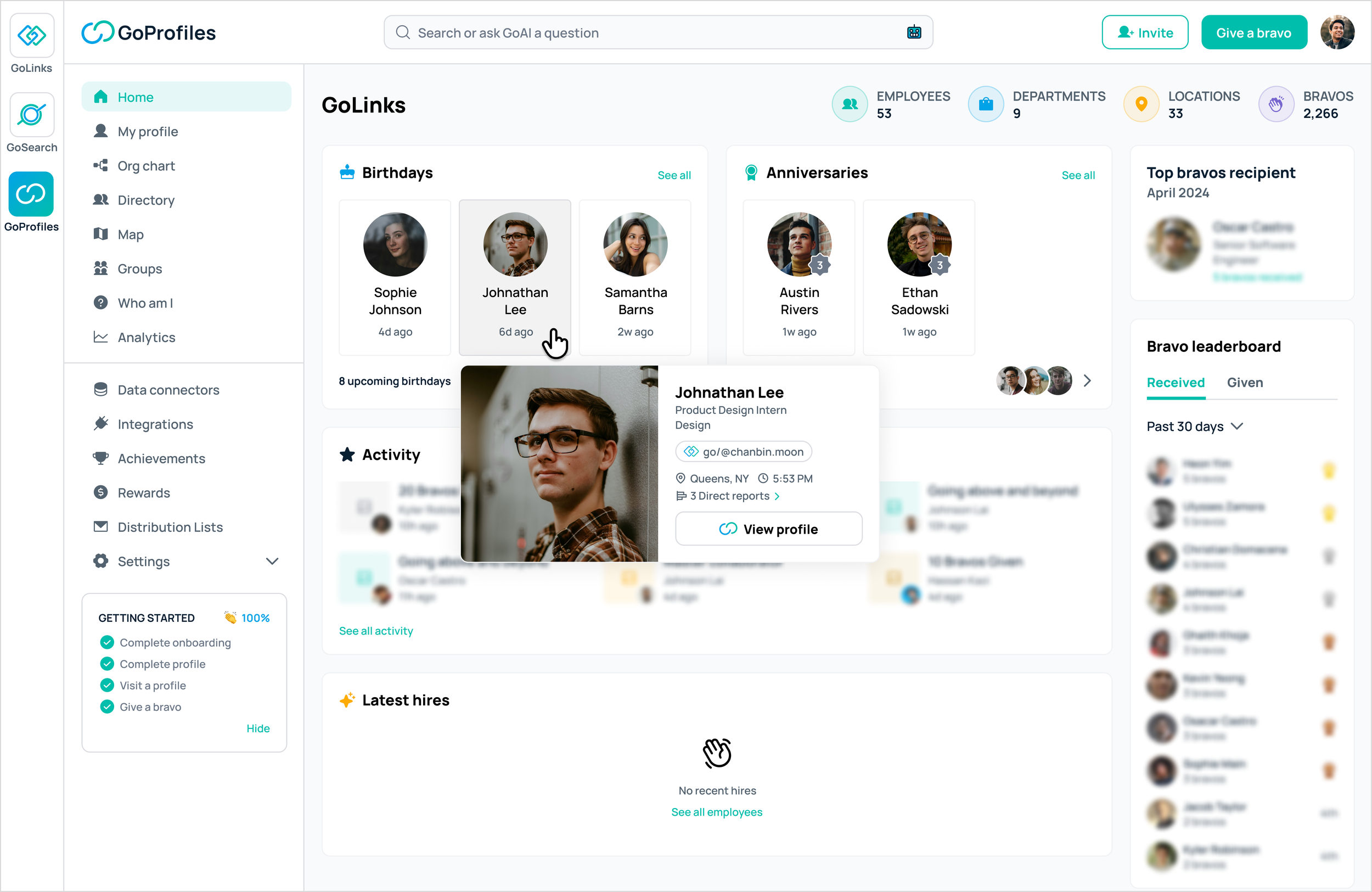
03. Design process and final design
🏗️ Iterations
After understanding the task requirements and syncing with my mentors, I made various iterations that could satisfy the user needs.
Iterations:
Keeping the vertical approach while rearranging the content within the card to decrease the height.
Removing informations that are of less priority to be on the card.
Implementing a horizontal layout while rearranging the content and trying tab experience within the card.

🏁 Final design
After reviewing the iterations with my mentors and testing them in different use case scenarios, we landed on the horizontal design.
The hover-cards were placed either on top or below the user cards depending on the location of the screen so it does not block potential cursor paths.
The image size was decreased to make the overall size of the card smaller and included only the necessary information to increase the usage of user profile pages.

👨🏻💻 Collaboration with engineering
I handed design over to engineering after finalizing it and communicated with them to clarify any areas that needed extra information.
After the designs went live on the platform, there were some minor alterations that needed to be done, which we were able to do swiftly thanks to the amazing GoProfiles engineering team.